Manchester Educational Foundation Branding
Where Structure Meets Student Success
Visual Identity For
Manchester Educational Foundation
![]()
Project Intro
MANCHESTER EDUCATIONAL FOUNDATION (MEF) supports learning environments across Pittsburgh by retaining and providing education space and educational services for Manchester Academic Charter School and Manchester Youth Development Center. However, their mission needed a visual identity reflecting both stability and academic excellence.
Client: Manchester Educational Foundation
Liaison: Vasilios Scoumis
Location: Pittsburgh, PA
Project Description
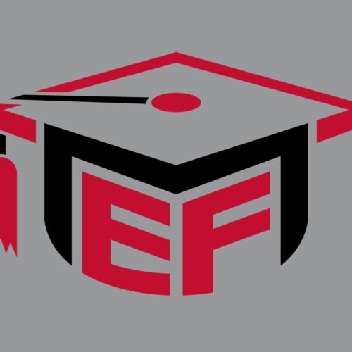
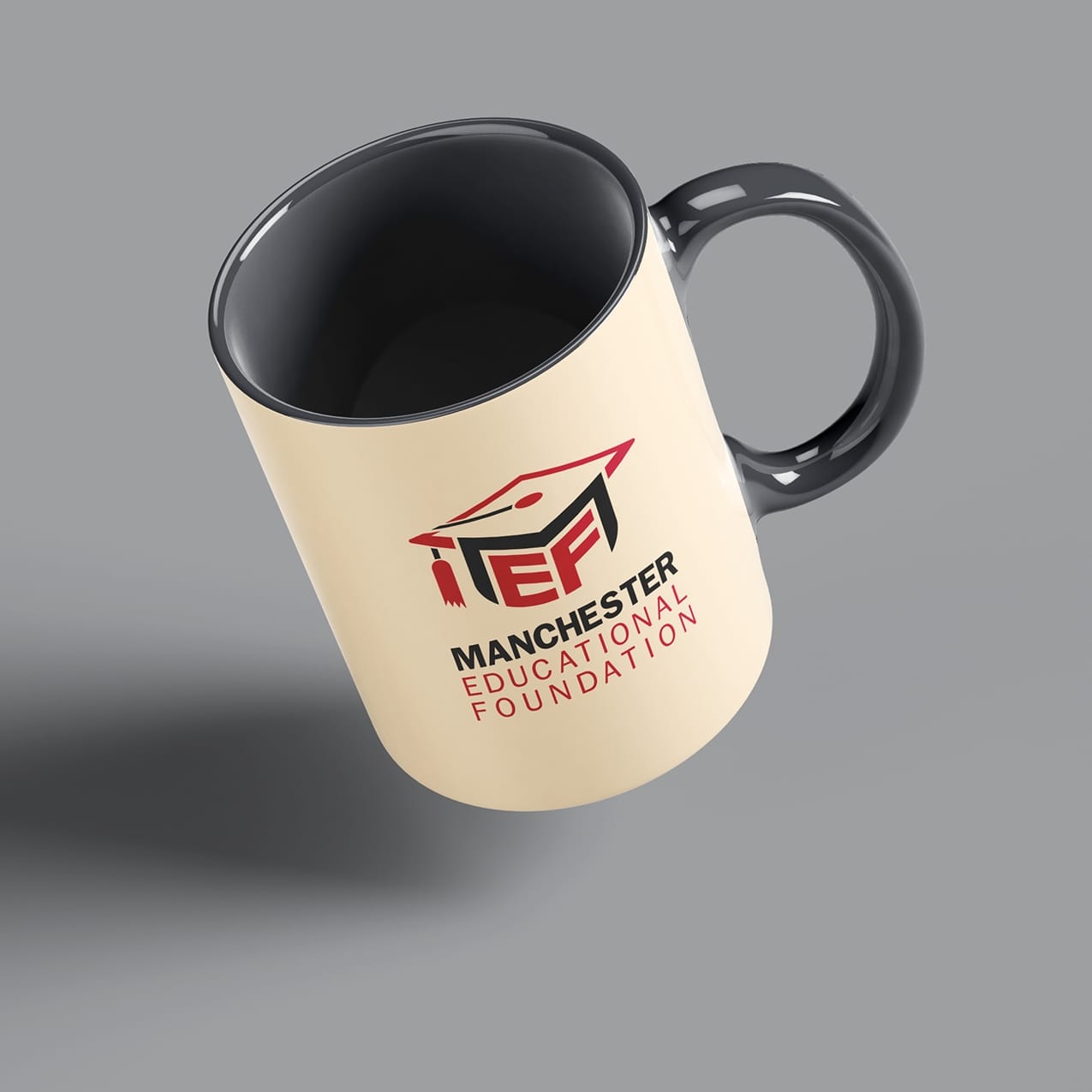
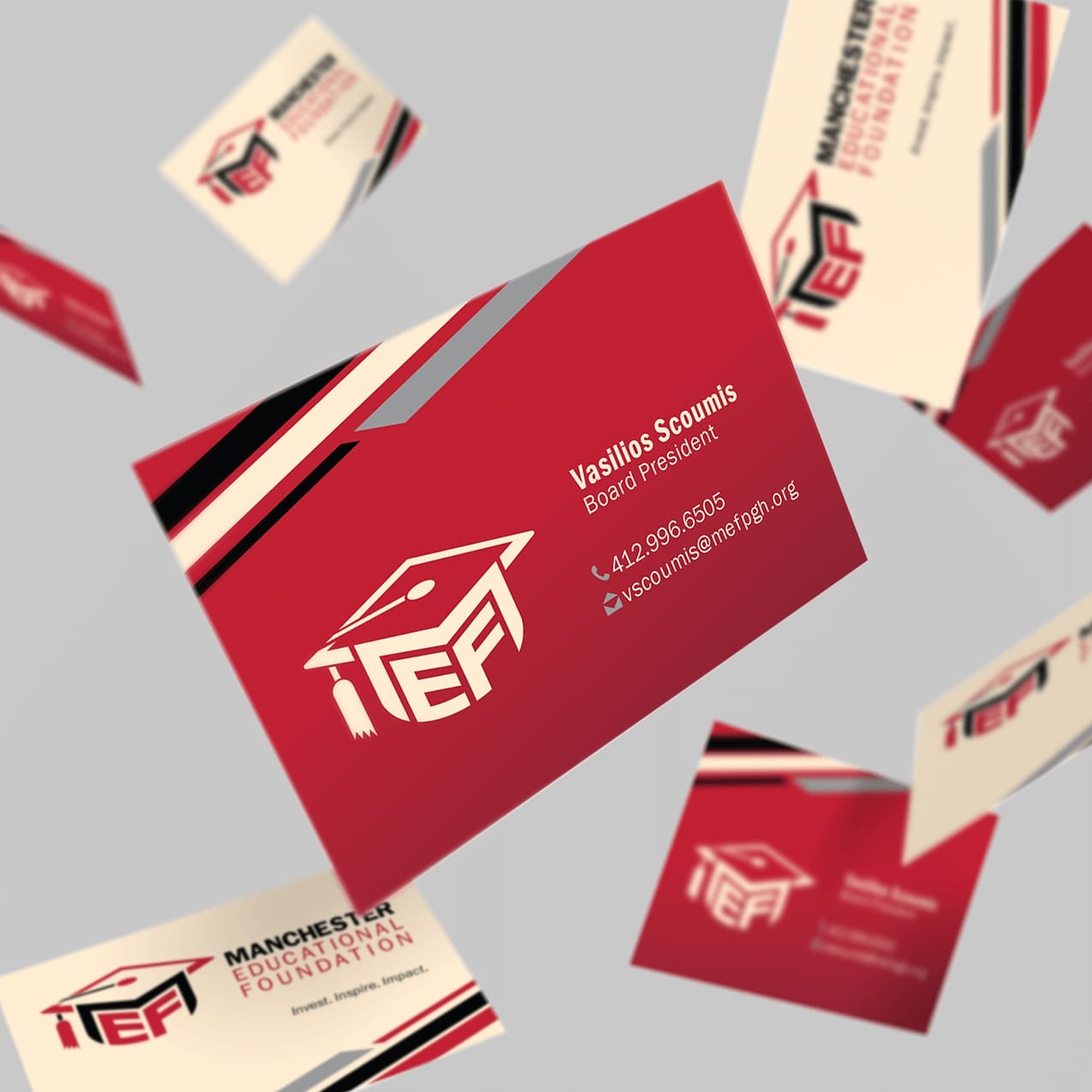
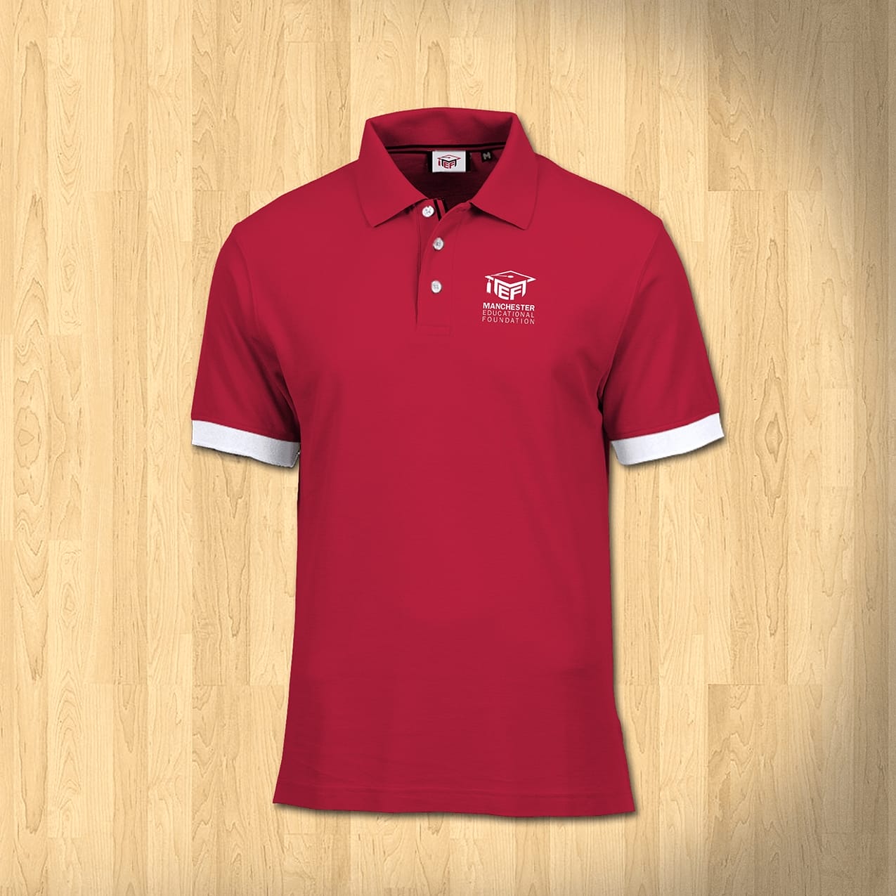
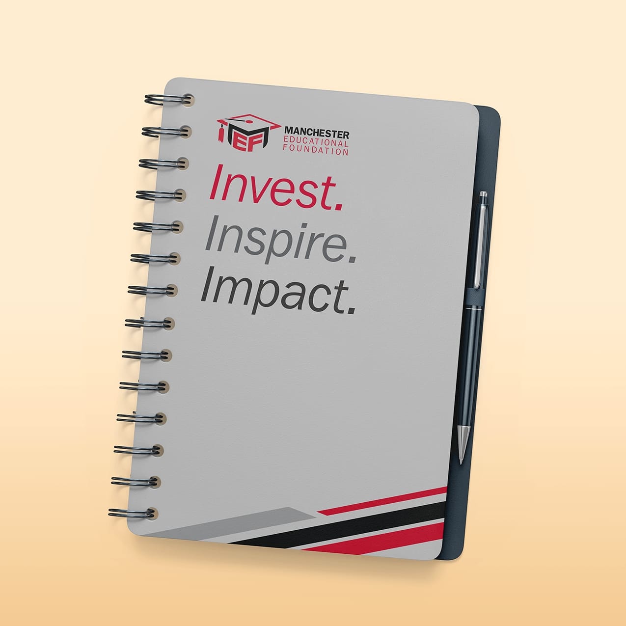
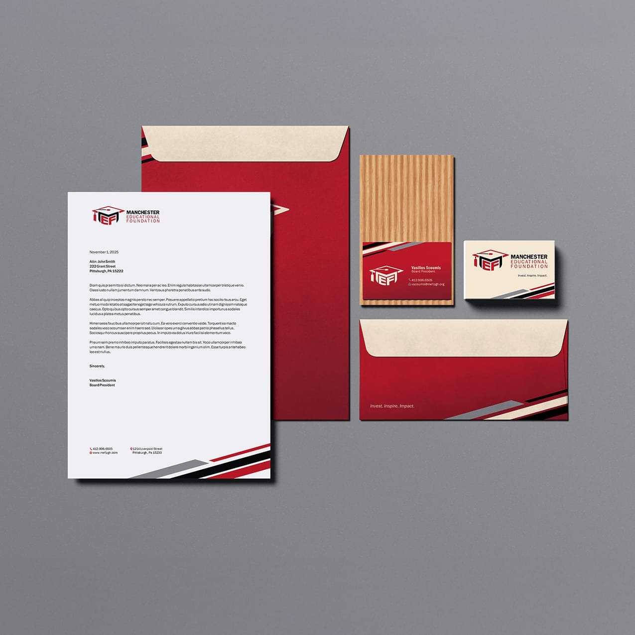
Our education branding solution features a stylized MEF acronym ingeniously shaped into a graduation cap. This contemporary design merges clean lines with purposeful geometry, creating an emblem that communicates precision and unity. The logomark positions MEF as an organization maintaining rigorous standards while acquiring properties that house transformative programs.
![]()
Strategic Design Drives Community Impact
By distilling MEF’s complex role into one powerful symbol, we created instant recognition and credibility. The graduation cap iconography bridges facility management with student achievement, positioning Manchester Educational Foundation as the cornerstone of quality learning spaces throughout Pittsburgh’s diverse communities.
![]()
RETURN TO CLIENT WORK
Let’s Chat
Ready to Upgrade? Let’s Connect.
Brothers and Sisters Emerging (BASE)
Bold Youth Empowerment Visual Identity
Inspiring Youth Empowerment Branding for BASE
![]()
Project Intro
BROTHERS and SISTERS EMERGING (BASE) uplifts young people in Pittsburgh by connecting them and their families to sports, mentorship, and advocacy resources. Built by dedicated volunteers, BASE creates a network where teamwork and empowerment fuel positive transformation. Solid Optix partnered to deliver a brand identity that celebrates youth resilience, encourages possibility, and solidifies the organization’s mission-driven leadership in its thriving community.
Client: Brothers and Sisters Emerging
Liaison: Bob Jones
Location: Pittsburgh, PA
Project Description
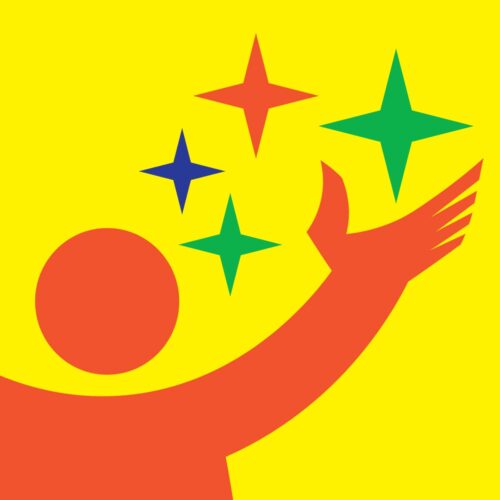
The BASE logo centers on the acronym in a bold, italicized font to symbolize energy and movement. The “A” cleverly morphs into a reaching human figure, surrounded by four vibrant stars—each star representing a pillar of development: social, emotional, educational, and economic. This upward motion captures the spirit of perseverance and achievement, while the contemporary design offers instant visual recognition across all channels.
![]()


Empowering Futures. Reaching for Stars.
Solid Optix’s logo design for BASE encapsulates hope, determination, and the importance of strong community ties. This cohesive, mission-driven branding helps BASE stand out, unite supporters, and inspire youth, making it a memorable symbol of empowerment and achievement for years to come.


RETURN TO CLIENT WORK
Let’s Chat
Ready to Upgrade? Let’s Connect.
A Better Choice
Home Health Branding Excellence
A Vibrant and Caring Brand Identity for A Better Choice
![]()
Project Intro
A Better Choice Home Health Care provides essential in-home support for individuals across Western Pennsylvania, helping with daily living activities and community-based services. Solid Optix created a distinctive visual identity that reflects compassion, trust, and professionalism—values central to the brand’s mission.
Client: A Better Choice Home Health Care
Liaison: Alicia Roebuck
Location: North Versailles, Pa
Project Description
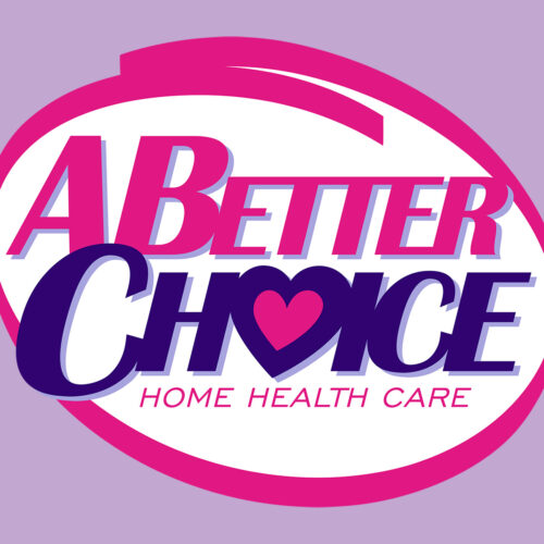
The logo design combines bold typography with a circular form to express unity and dependability. A heart symbol inside the word “CHOICE” adds emotional warmth, emphasizing the company’s commitment to health and comfort. The color palette of magenta and deep purple represents vitality and reliability, ensuring strong visual recognition. The color palette of magenta and deep purple represents vitality and reliability, ensuring visual recognition.
![]()


A Cohesive and Compassionate Design
Built on data-driven design principles, this rebrand positions A Better Choice as both approachable and professional, helping them connect authentically with their audience while standing out in the competitive home health industry. By aligning aesthetics with purpose, Solid Optix delivered a branding solution that is both heartfelt and future-focused—helping strengthen market presence and foster long-term trust with its community.

![]()

![]()
RETURN TO CLIENT WORK
Let’s Chat
Ready to Upgrade? Let’s Connect.
O.C.E.A.N., Inc.
Community Action Branding That Inspires
Elevating Community Action: OCEAN Inc. Branding Refresh
![]()
Project Intro
O.C.E.A.N., Inc. has been a pillar of support for Ocean, Atlantic, and Cape May Counties since 1965, empowering residents with vital resources and opportunities. As a grassroots Community Action Agency, their holistic, people-centered approach drives lasting positive change. Solid Optix partnered with O.C.E.A.N., Inc. to create an updated brand identity that amplifies their mission of hope, inclusion, and community well-being.
Client: O.C.E.A.N., Inc
Liaison: Tamica Mickle
Location: Toms River, NJ
Project Description
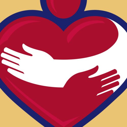
The logo refresh for O.C.E.A.N., Inc. carefully preserves their symbolic negative space concept, now featuring a stylized crimson heart and embracing arms encircled by bold blue. Topped with a circular form suggesting a person, the imagery radiates warmth and compassion. Carefully selected colors evoke passion (crimson) and trust (blue), representing the agency’s urgency and reliability. The updated branding helps O.C.E.A.N., Inc. advance its outreach and position them as a trusted community partner.
![]()


A Cohesive and Compassionate Design
The refreshed identity reinforces community unity and self-sufficiency, building loyalty and recognition. Through adaptive strategy and purposeful design, Solid Optix enables O.C.E.A.N., Inc. to continue uplifting lives—helping people help themselves and others, fostering sustainable growth and ongoing engagement.


LifeVenture Buy Choice Homes
Enhancing Community Impact
LifeVenture Buy Choice Homes
Marketing Collateral

Project Intro
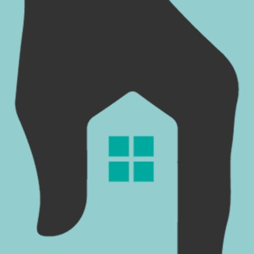
Solid Optix partnered with LifeVenture Buy Choice Homes to develop real estate branding that clearly communicates their dedication to equitable homeownership and financial education. Our approach combines strategic design with purposeful messaging to engage and inspire their target audience.
Client: LifeVenture Buy Choice Homes
Liaison: Mary Hester
Location: Pittsburgh, Pa
Project Description
Using data-driven insights, we created cohesive real estate branding that highlights LifeVenture’s unique value. From compelling visuals to user-friendly digital assets, every element supports their goal of making real estate opportunities accessible and understandable for all.


Building Community Trust
Our collaboration demonstrates how focused real estate branding can amplify a company’s mission and market reach. By integrating clear communication and strategic design, Solid Optix helps LifeVenture Buy Choice Homes connect authentically with clients, fostering trust and encouraging long-term financial growth through real estate.


Garfield Gators
Elevating Youth Football
Garfield Gators
Logo Refresh
![]()
Project Intro
The Garfield Gators, a 29-year-old youth football powerhouse in Pittsburgh, PA, needed a brand refresh to match their stellar reputation. Solid Optix stepped up to the challenge, creating a dynamic branding package that captures the organization’s essence.
Client: Garfield Gators
Liaison: Robert Jones
Location: Pittsburgh, Pa
Project Description
At the heart of the Garfield Gators Branding is a fierce, muscle-flexing alligator mascot. This bold illustration embodies the strength and discipline that define the Garfield Gators. By stripping away unnecessary elements, we ensured the mascot’s powerful characteristics take center stage.
![]()
![]()
![]()
Comprehensive and Cohesive Branding
Our branding solution includes a versatile logo system. The striking mascot can stand alone or pair with the custom logotype, creating a flexible identity for various applications. From digital platforms to physical merchandise, this cohesive branding package sets the Garfield Gators apart in the competitive world of youth sports.


POISE Foundation
Striking Brand Solutions
POISE Foundation
Marketing Project

Project Intro
Solid Optix partnered with POISE Foundation to modernize their marketing materials, reflecting over 40 years of community impact while positioning them for future growth. Our design solutions enhance donor engagement and unify their brand presence.
Client: POISE Foundation
Liaison: Sylvia Reid
Location: Pittsburgh, Pa
Project Description
We crafted a cohesive suite of branded assets including brochures, banners, business cards, and stationery. These materials balance POISE’s rich heritage with a forward-looking message, effectively connecting with donors, partners, and the community to support their mission.


Branding That Resonates
By combining strategic design with POISE Foundation’s powerful story, we delivered marketing tools that inspire action and foster lasting connections. This refreshed branding supports their growth goals and strengthens their role as a vital community foundation.


Just Desserts Podcast
Unapologetic Conversations
Just Desserts Podcast
Brand Project
![]()
Project Intro
Solid Optix partnered with the Just Desserts Podcast to design a brand identity that captures its fearless spirit and commitment to honest conversation. Our approach combined striking visuals with strategic insights, ensuring the brand stands out and resonates with its core audience.
Client: Just Desserts Podcast
Liaison: Bruce Lindsey
Location: Sharon, Pa
Project Description
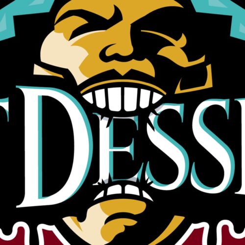
The Just Desserts branding features a powerful illustration of a man biting into the podcast’s name, symbolizing an appetite for truth and open dialogue. A classic serif font adds authority, while the bold, dripping outline reflects the raw, unfiltered nature of the content. This cohesive design ensures instant recognition across all platforms.
![]()


Community and Real Conversation
This brand identity was crafted for listeners aged 35–50 who value authentic advice and community. The color palette—black, burgundy, gold, slate gray, and vibrant teal—balances tradition with modern energy. By blending streetwise wisdom and warmth, the brand invites audiences to engage, share, and return for more meaningful discussions.


Voluptuous Lady Boutique
Redefining Plus-Size Fashion
Voluptuous Lady Boutique’s
Brand Transformation
![]()
Project Intro
Voluptuous Lady Boutique, a trailblazer in plus-size fashion, sought a brand refresh to match their commitment to empowering women. Solid Optix rose to the challenge, creating a striking visual identity that resonates with their core audience.
Client: Voluptuous Lady
Liaison: Shateesha Murphy
Location: Pittsburgh, Pa
Project Description
At the heart of the design is a powerful icon featuring a confident woman draped in an elegant gown, framed by a capital “V”. This bold illustration embodies the pride and beauty of plus-size women, conveying an unapologetic and fearless attitude. Our branding solution includes a sophisticated color palette and carefully selected fonts that exude class and boldness.
![]()
![]()

A Unified Identity System
This unified identity system seamlessly integrates across various marketing materials, from digital platforms to in-store displays. The result is a brand that not only speaks to Voluptuous Lady Boutique’s existing clientele but also attracts new customers, expanding their reach in the competitive world of fashion.

HelloBoutiq
Advancing Handcrafted Resin Art
HelloBoutiq
Brand Redesign
![]()
Project Intro
At Solid Optix, we’ve breathed new life into the HelloBoutiq brand, showcasing their handcrafted resin art with a logo that exudes timeless elegance. The sleek, hand-scripted logotype perfectly balances tradition and contemporary appeal, ensuring visibility across all platforms.
Client: HelloBoutiq
Liaison: Daynell Marbury
Location: Pittsburgh, Pa
Project Description
For HelloBoutiq, a hand-drawn lily symbolizes exclusivity and renewal, reflecting the artistry behind each unique piece. The versatile HB monogram reinforces the brand’s refined attributes, seamlessly integrating into various media. This thoughtful design not only captures HelloBoutiq’s warm charm but also highlights their commitment to eco-conscious, personalized treasures.
![]()


Thorough and Seamless Branding Solutions
By aligning visual identity with core values, we’ve positioned HelloBoutiq as the go-to destination for discerning customers seeking one-of-a-kind gifts and home decor.


Vernard Alexander
Crafting a Regal Identity for the Networking King
Vernard Alexander
Visual Identity
![]()
Project Intro
At Solid Optix, we thrive on challenges that push creative boundaries. Our collaboration with Vernard Alexander. exemplifies this passion. We were tasked with developing a brand identity that captures the essence of the “Networking King” and his dynamic business coaching empire.
Client: Vernard Alexander, Inc
Liaison: Vernard Alexander
Location: Pittsburgh, Pa
Project Description
We dove deep into Vernard’s core values, analyzing his unique position in the entrepreneurial landscape. We crafted a logo that seamlessly blends professionalism with approachability, mirroring Vernard’s expertise and personable nature.
The result? A powerful interlocking monogram that symbolizes connectivity and bridges gaps for entrepreneurs. We paired this with carefully selected typography to enhance readability and convey trust.
![]()


Integrated and Consistent Branding Approach
This project showcases our data-driven approach to branding. By understanding Vernard’s target demographic and psychographics, we created a visual identity that resonates with ambitious professionals seeking growth and innovation.


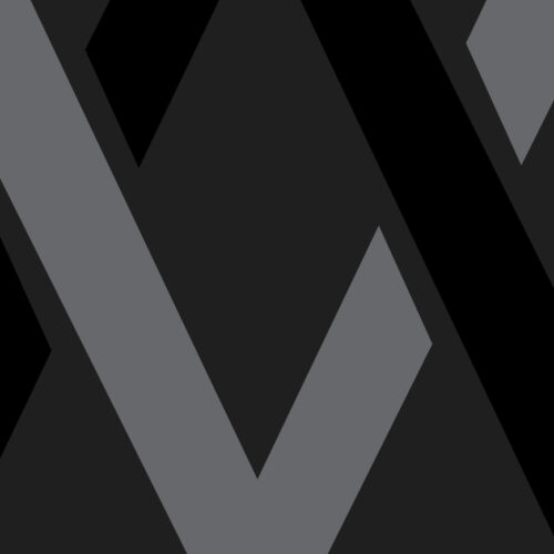
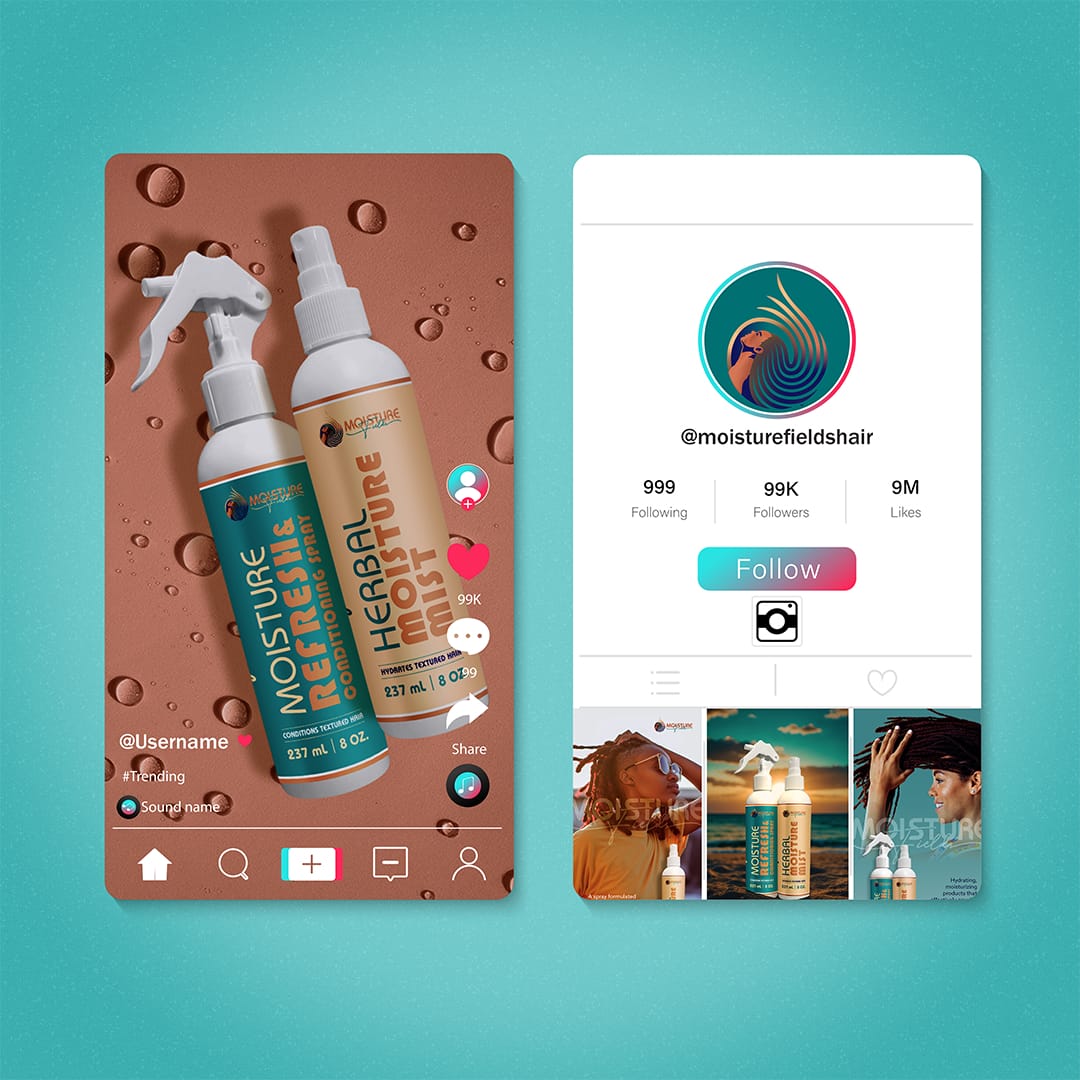
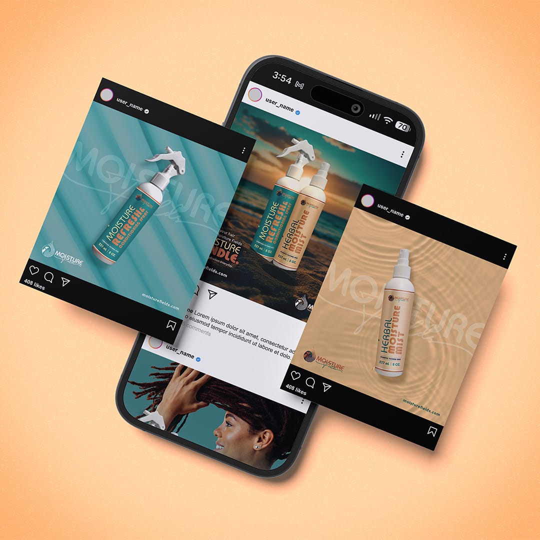
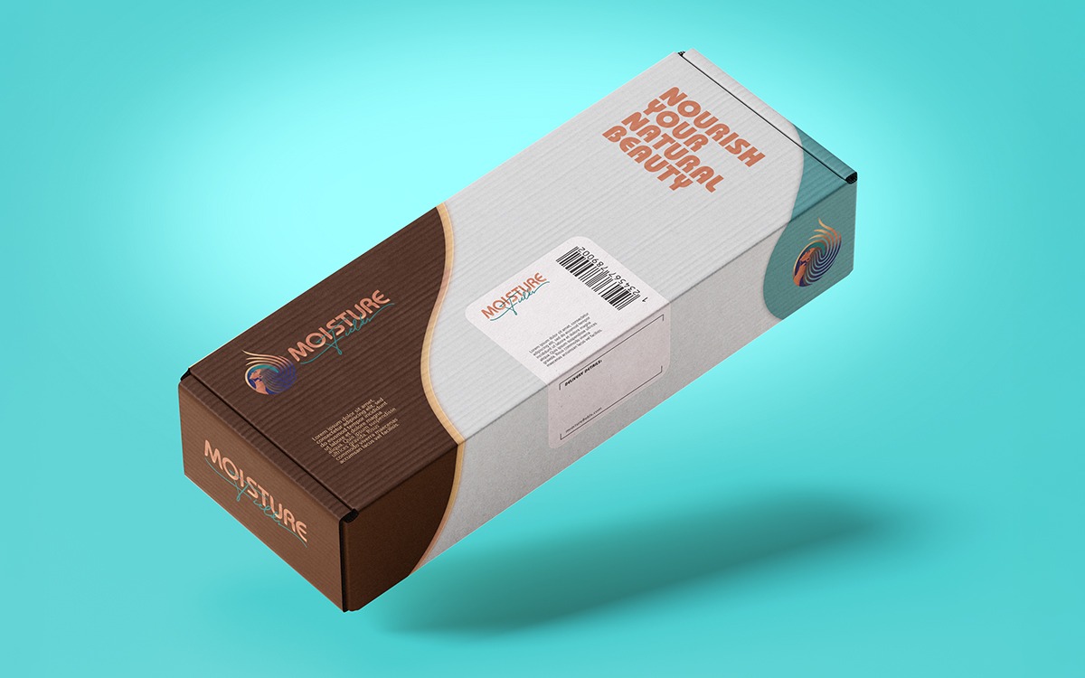
Moisture Fields
Redefining Natural Hair Care
Moisture Fields
Brand Project
![]()
Project Intro
Moisture Fields, a trailblazer in type 4 hair and loc care, sought a brand identity to match their innovative formulations. Solid Optix embraced this challenge, creating a striking visual narrative that resonates with their target audience.
Client: Moisture Fields
Liaison: Tanisha Russ
Location: Pittsburgh, Pa
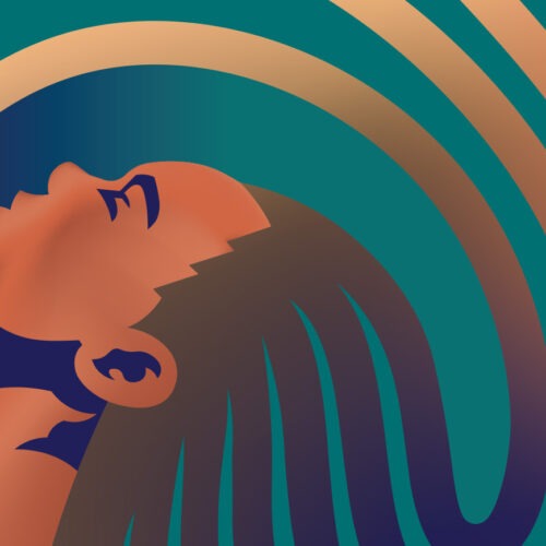
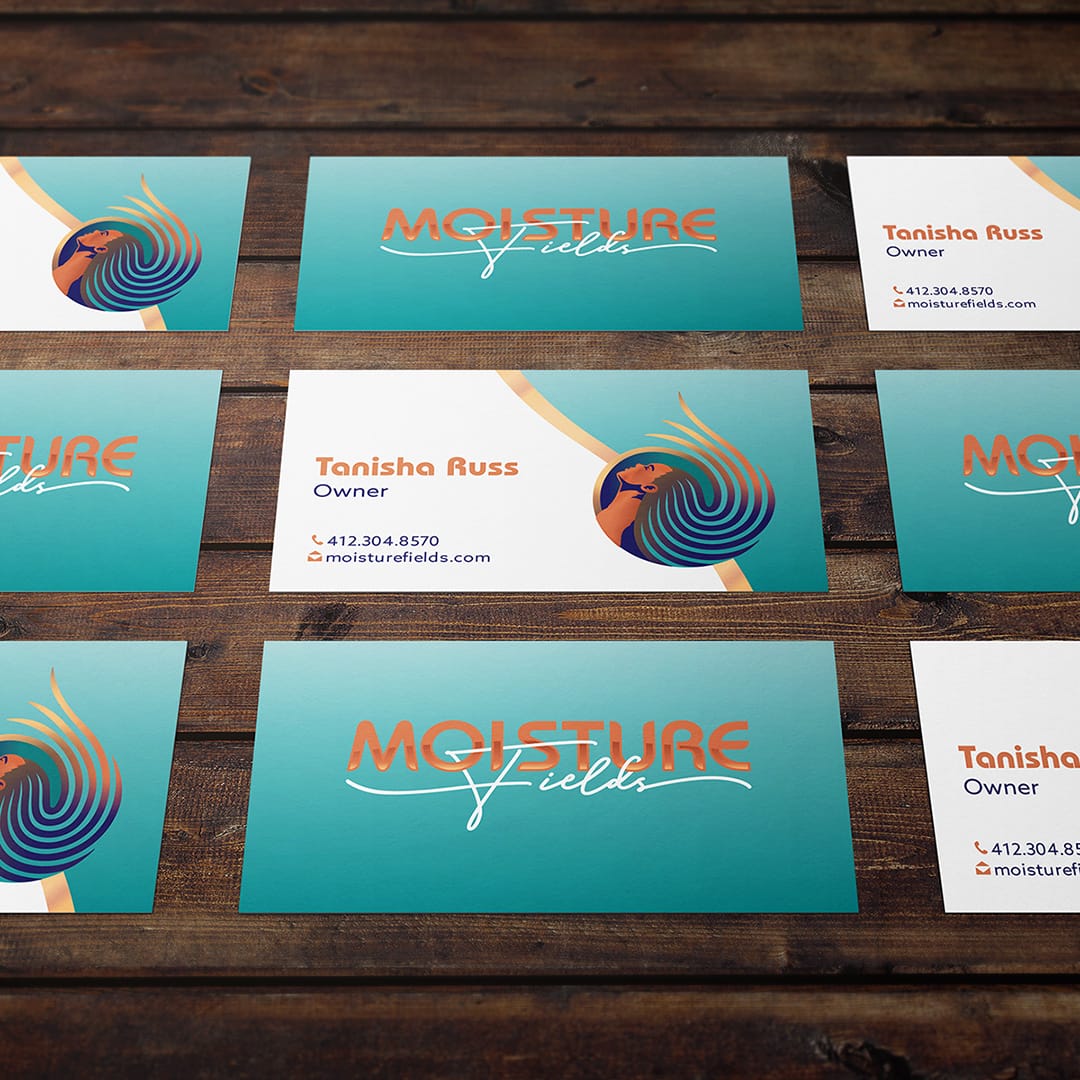
Project Description
The centerpiece of the design is a powerful icon featuring a confident woman with flowing locs, framed within a water droplet. This bold illustration embodies the brand’s commitment to moisture retention and natural beauty, conveying satisfaction and relief.
![]()
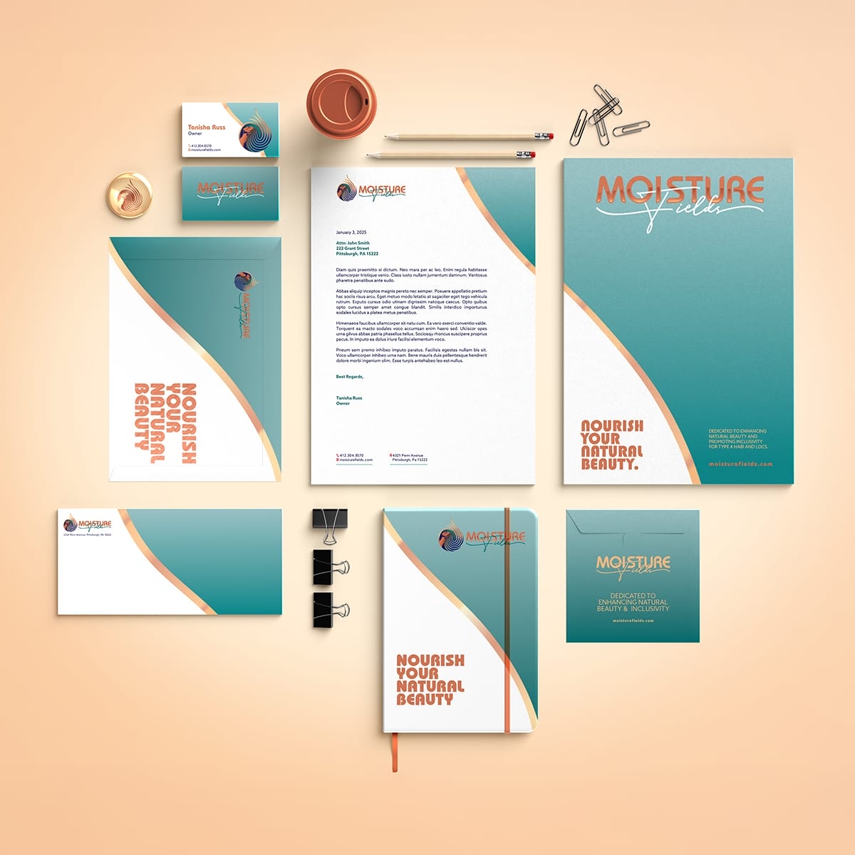

Holistic and Unified Brand Strategy
Our brand package includes a thoughtful typography blend, pairing modern Bauhaus with an elegant script. The color palette, rich with blended hues, accentuates movement and sophistication. This cohesive identity system seamlessly integrates across various marketing channels, positioning Moisture Fields as a refreshing, relatable brand in the world of natural hair care.


RETURN TO CLIENT WORK
Let’s Chat